And so it happened that one day I received the briefing of a life time: “Choose any of this simple applications and make it pretty. The idea is to have a graphic interface that would challenge Qt so that it could be improved. The end result has to be a demo to be shipped with Qt as an example”. Imagine that! Do something cool, don’t worry about the possible limitations of the technology, we want to really push the envelope. The downside? Have it ready by the end of the week.
So I put a team together – me (graphic design), Tâmara Baia (interaction design) and Ian Moreira (motion design) – and got to it. The process was simple: choose the application > bash it > define new solutions for the features > put it back together > send it to the development team.
Choosing the application
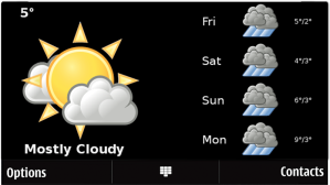
From all the available demos we had one of our favorites was a weather application – simple and full of graphical possibilities for weather icons are diverse and fun. The application we chose was already working, displayed real time weather info and a four day forecast of the list of cities available. It had simple static icons. In short, I was designed by a developer – it worked but had very little appeal – therefore it was perfect for our purposes.
Bash it
That was the easy part. Criticizing other people work – specially the GUI of a developer – from a designer’s perspective is just too easy. The application worked fine, but had poor tiny graphics. There was also too much info in every screen but the important info – such as current temperature – were very timidly displayed in a corner. There were no use of gestures what’s or ever, no touchscreen interaction as it relied on the options menu for navigation.
New solution for the features
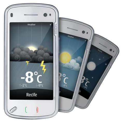
We didn’t change the features much, just reorganized the priorities. We decided to keep displaying one city at a time, but user could have as many cities as he wishes and use a gestures – slide left or right – to navigate through his list. We also got rid of some info – such as the weather forecast label, and hid the 5 day forecast in the options menu, as a total different mode so user could choose between 5 day forecast mode and city list mode. We put a lot of emphasis on the graphics – very big and complex animated icons. Since there were a great number of types of weather, we made a list, and combined the icon pieces to create all the possibilities. The only feature we really added was the night view – night background, the moon and stars, acording to the time at the displayed city.

We ended up with: A bright yellow sun, a colder one for cloudy and rainy days and a moon. Displaying the different moon phases was another feature we thought of – but due to the little time it was not implemented, yet (fingers crossed). There are three types of clouds and three layers for every type – to give a little depth.
To make it fun, we decided to put all the icons hanging on a string, like little stage elements in a play. From the string to the idea of making slide down from the top of the screen and bounce cutely in the middle of the “stage” it took seconds. Then all sort of animation ideas came up, but the little time kept us concentrated on the transitions animations.

Speaking of transitions, one of our challenges was how to change from a cold rainy night background to a bright sunny day one. That would require a full screen animation and we know that it takes a lot of processing and it could make the application too slow on s60 phones. Well, they did ask for a challenge, so glued all the background images together with sticky-tape and hope for the best.
Put it back together
There was little time, so the task flow was all pencil and paper. Ian started the flash mock up while Tâmara mapped all the types of weather and I worked on the graphics – first the UI items, then the icon pieces (once Tamara had finished the looooong list of types). We ended up with a flash mock up, displaying a list of 3 cities, with the larger number of examples we could provided – night and day, sun and moon, clear sky and animated snow. There was no time to include all possibilities in the mock up, so we focused on the extremes. At the end I put all our ideas together in a product backlog format – even the ones we knew there would be no time to develop, just in case.
Send it to the development team
The development team received a prioritized product backlog, the flash mock up, all the chopped down graphics, some graphics and animations specs, spec for all the types of weather pieces combination and the randomness with thought would be fun to have, and a storyboard for the features we didn’t include on the mock up due to the lack of time. We also had to work very closely to the development team as they put it all together. Mainly to provide the info they lacked and to do some graphics and animation QA along the way.
Once it was all done and ready we’re all very happy with the results, so Tamara came up with the idea of making a video, showing – in a very short 45″ – all the process in the design team.
That was another team effort, with Ian leading the motion while learning his way around aftereffects. We used a video of the actual final version of the application, running, available for download with Qt 4.6 as an example of its capacities (I’ve got to tell you that it runs beautifully on the 5800 we had available to test – just lovely).
The song is “The Sky and the Rain”, performed by Snooze, a local band Ian’s of friends, and it makes the video look even cuter. Now we’re thinking of a full version of the video, but that’s for the future.